Overview
The Blick Arts and Crafts store experience is dense, tactile and visual. Their existing website suffers from an ambition to do too much all at once, which makes their online experience forbidding to both expert and casual customers looking to make their art supply purchases online.
With the help of user and competitive research, it was my goal to produce a design proposal for an online experience that is clean, clear and visually driven, but that would would also address the tactile as well as scaleable to encompass all of Blick's offerings and customer needs. Ultimately, I want Blick's customers to be delighted and engaged while on the site, which will encourage them to come back time and again.
The existing (circa Fall, 2017) Blick web experience is dense and difficult to navigate.
Why
The project was interesting because it presented a challenge to provide a solution that would, both, encompass the breadth of all of Blick’s offerings, as well as visually delight and welcome all customers.
My Role
For this 2 week sprint project, I acted as researcher, information architect, and designer.
Tools
Paper and Pen, Axure, Google Sheets, and Keynote
Process
Discovery
I performed competitive analysis, contextual inquiry, and user research to identify what was important to users.
Testing
I performed usability testing of the new site, asking users to complete multiple scenarios that would validate or provide further feedback into my solutions.
Design
I worked to simplify the store's organization of materials into a more accessible format. I wireframed, iterated, and sketched out a new version of the website.
Prototype
I incorporated their feedback into my solution, producing an even more user-focused design.
Discovery
Competitive Analysis
A review of Blick's major competitors, selected by comparing business models, product selection, and brand recognition, showed their online experiences shared one or more of the following criteria:
- Easy navigation between categories
- Searchable
- Images and descriptions are large and clear
- Checkout process is modern and straightforward
Survey
A survey of 88 people between the ages of 21 and 40 showed that everyone shops online. It also showed almost 75% of customers have shopped at major chain retailers in the last 3 months (September, 2017).
Additionally, while most professed comfort in shopping both in-store and online, only ~5% preferred the in-store experience.
Interviews & Personas
In order to better understand Blick's online customers, I interviewed multiple users and identified two personas: The Artist, and The Non-Artist
Persona: The Artist
Artists, I found, share some of the following characteristics when shopping for art supplies:
- They are browsers
- Their selection of tools and supplies is very personal
- They will shop for specific projects
- They are very tactile, getting up close with the tools and supplies
- They require the ability to pick and choose and change their mind frequently
“When I shop in-store, I like to browse […] to pick up pencils and look at them, see how they feel…”
Persona: The Non-Artist
Non-Artists, I found, share some of the following characteristics when shopping for art supplies:
- They are searchers
- They are less targeted in their shopping
- They want to get in and get out
- They are more concerned with price and accessibility
- They value efficiency and accessbility
“I just want to find a good deal for my friend’s gift”
Solution Statement
Based on this research, I determined the new website needs to be visually and aesthetically pleasing. However, it must, also, be accessible to both experts and laypeople, alike. Users must be able to navigate around the site with ease, with common-sense access to their shopping cart, and a low pressure environment that will allow them to pick and choose items quickly and without unnecessary clicks.
“I’m an extremely indecisive person...”
Combining the user and competitive research, as well as a heuristic analysis of the competition and a product card-sort, I started producing sitemaps to produce the information architecture for a site that would be easily navigable, but also scaleable to account for all of Blick's products and offerings.
As I started seeing how the sitemap was going to look, I began designing user flows. Based on the data, I designed these flows with the two challenges in mind:
- Maintain the aesthetic design
- Address the IA challenges
Sketching & Iteration
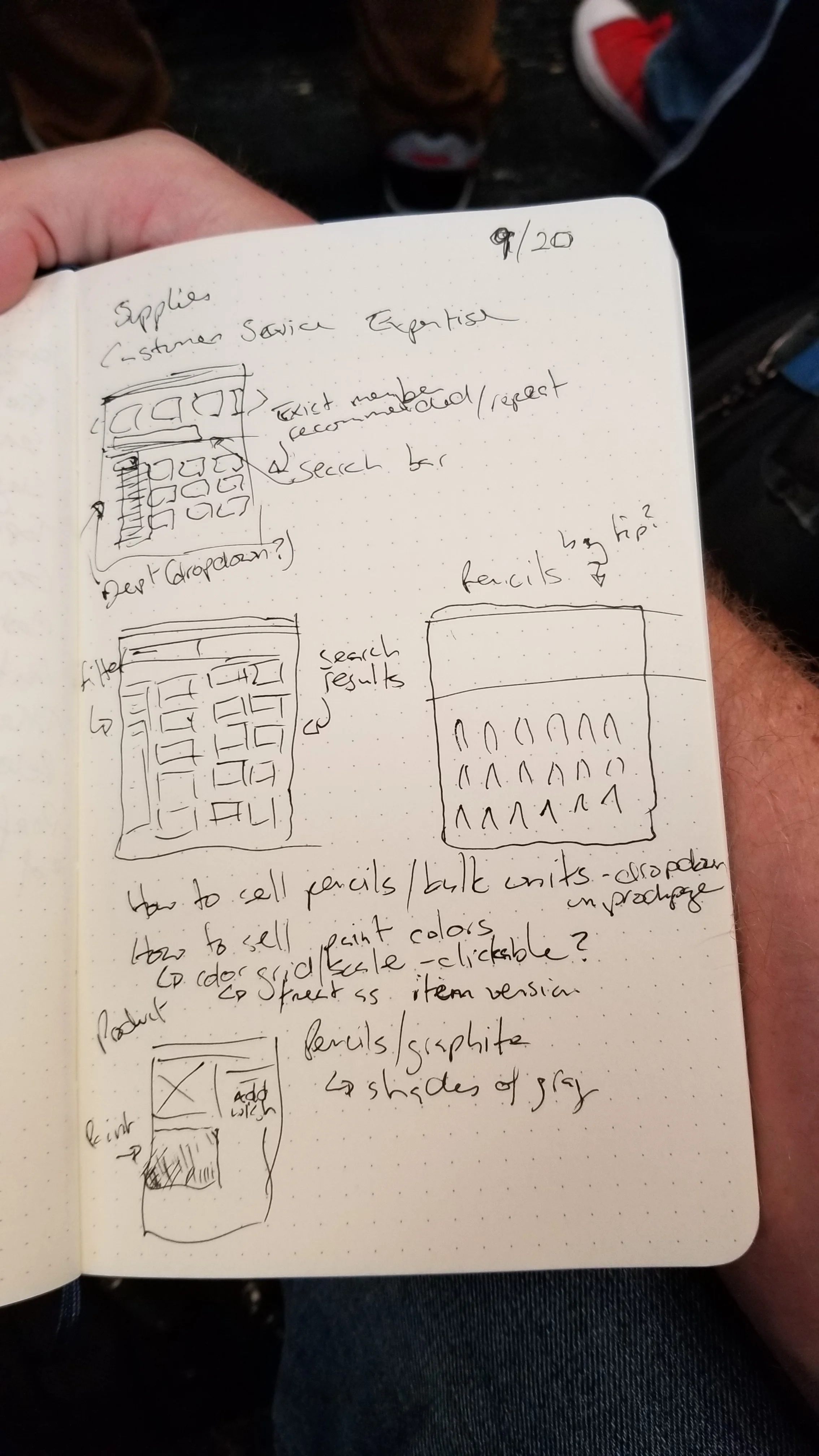
Throughout the process, but particularly once the sitemaps and user flows began to take shape, I sketched out the various pages of the site, iterating on ideas and drawing inspiration from, both, my research and the styles seen in other successful sites.
Prototype
The final phase of the journey was digitizing the wireframes in Axure. Realizing my research, theories and drawings into the digital medium made it easy to start testing.
The design is intended to be minimalistic and clean in order to allow the tools and supplies to speak for themselves. The information architecture keeps the design simple and navigable so that customers can find what they need quickly, through common-sense departments and categorizations.
The tactile feeling of picking up and examining tools, such as pencils and brushes, demanded by artists and non-artists alike is achieved with a hover-state expansion on the category pages. When the pointer is allowed to linger on a product listing without clicking, a larger, more detailed image appears, giving the customer a closer look at the pencil tip, brush head, etc.
Product listing hover Expansion
The following video shows a complete user flow, from homepage to checkout.
Usability Testing
Scenario:
You’re an artist. You have a project in mind that you’re really excited about but need to do some extensive sketching. You’re fresh out of pencils and your old sketchpad is full.
Task:
Starting from the home page, browse for a pencil and buy a new sketchpad.
This scenario was simple and clear for my testers, so it presented a good deal of useful data and feedback.
All testers were given a System Usability Scale (SUS) survey to provide instant feedback on what they had tested. Their results validated the design choices, however, they also generated additional ideas for further development of the website proposal.
Testing produced a handful of suggestions, including:
- Add a light registration page to the checkout flow, after the purchase has been completed. Give customers the opportunity to create an account using all of the information they've already entered during the purchase process.
- Add a "Quick Add" button to the category pages, allowing the user to add multiple items at once.
- Change "New and Featured" products on the Category pages to "Popular", giving the casual customer quicker access to items they'll identify as credible.
Conclusions
This project showed what the design process can achieve when properly implemented. Taking a website that is difficult and unwieldy, and producing something that is much more accessible and, at times, even beautiful and delightful, was hugely gratifying.
Lesson learned
You can (almost) never iterate and sketch too much.
Take more pictures of the process to better show what steps were taken.


